Web design
Mobile app — Movie ticket booking
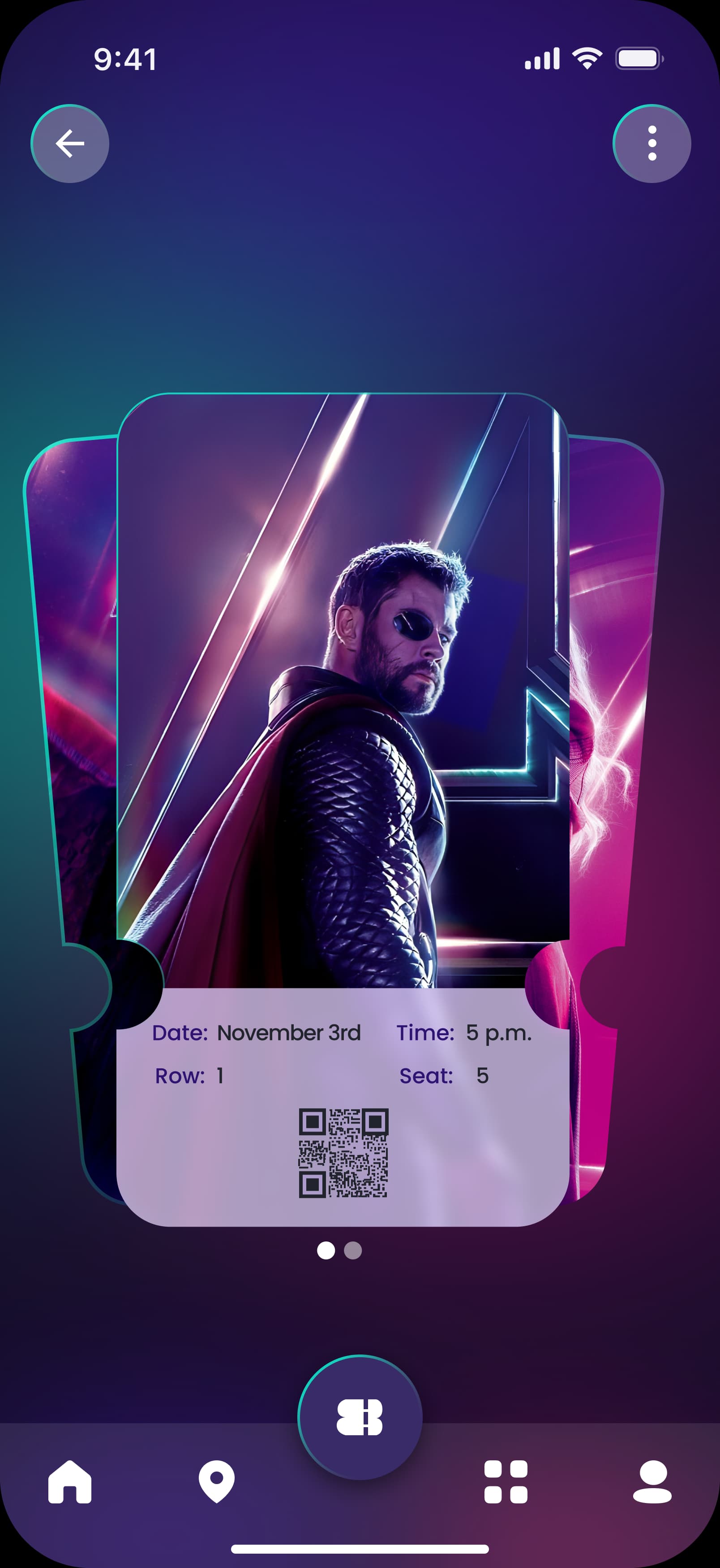
A complete mobile flow for booking a movie showing: pick the film, the showtime, the seats, and get a digital QR-code ticket.
- Client
- Projet de fin de formation - École AltHue
- Year
- 2025
- Category
- Web design
UI/UX Design | Mobile | Réservation en ligne

Personas
The time-pressed moviegoer
Book a seat in a few screens, often between two subway stops or right before the showing starts.
He has no time to compare showtimes: he wants the next available one, a decent seat, and a ticket he can use right away. Any step that doesn't directly serve that goal is a reason to abandon the booking.
The group outing organizer
Book several seats together for friends or family in a single pass.
She needs to clearly see which seats are adjacent and still free, not just which ones are taken. Once seats are picked, she wants to easily forward or share the tickets with the rest of the group.
The brand need
Booking a cinema seat online often takes too many steps and leaves little clarity on which seats are still available, especially on mobile where a dense seat map quickly becomes unreadable and a last-minute booking leaves no room for hesitation.
Research & art direction
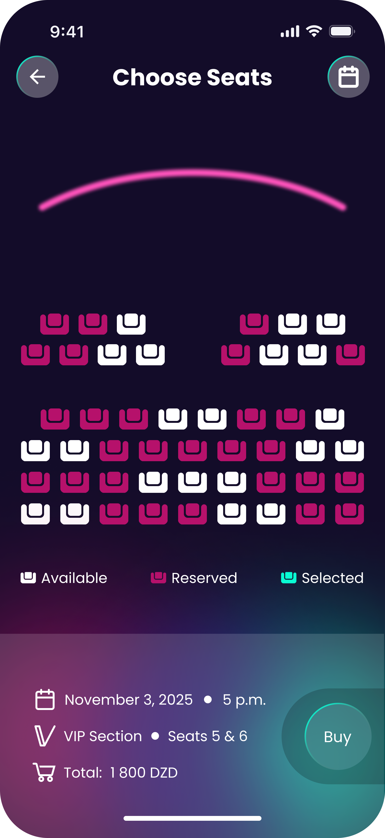
A benchmark of existing booking apps (cinema, live events, transport) to spot recurring friction points — too many steps, seat maps that are hard to read on a small screen, seat status (free, taken, VIP) that's hard to tell apart at a glance — and several interactive seat-map sketches, tested at real finger-tap size on mobile, before settling on the version that stayed legible even with a nearly full house.
The approach
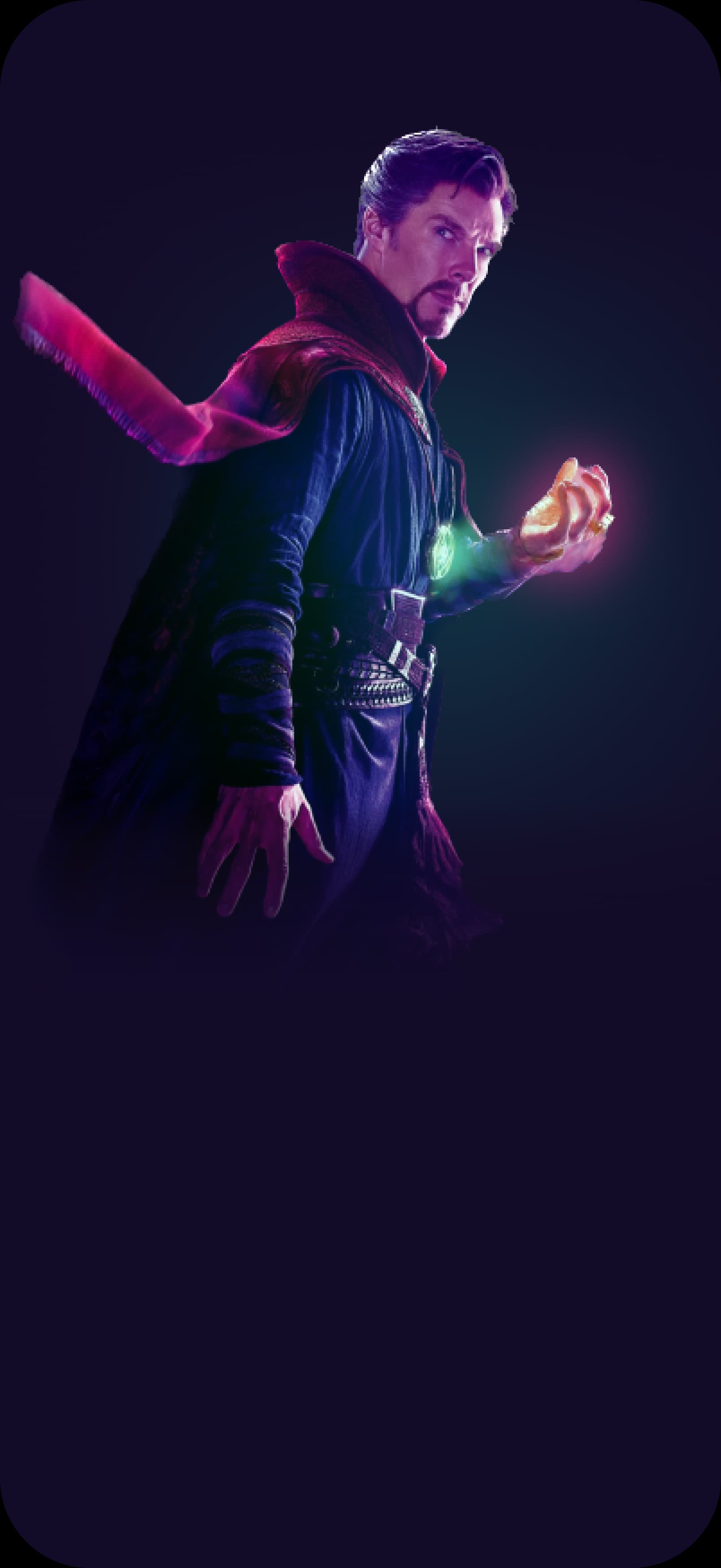
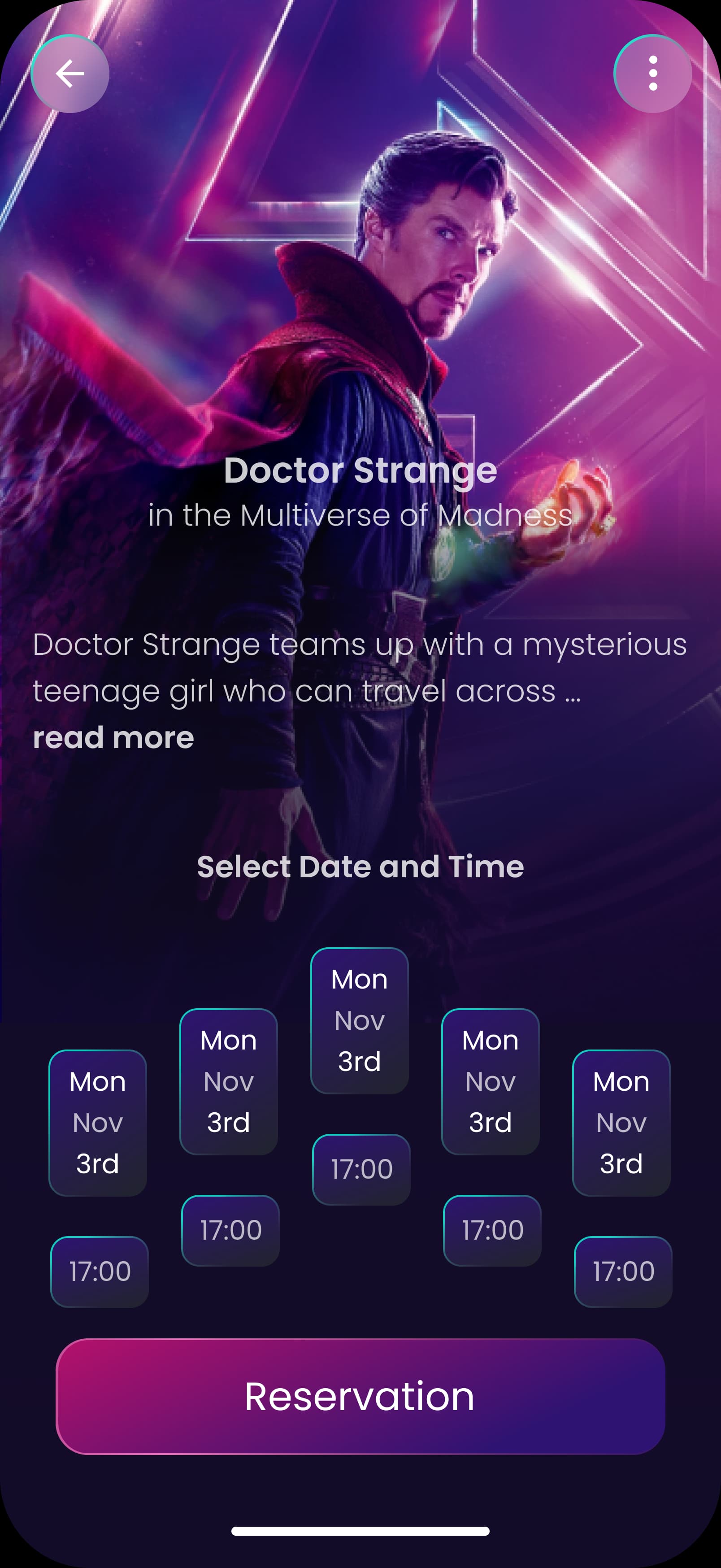
A tight four-screen flow — movie details, showtime picker, an interactive seat map with a VIP section set apart by color, and checkout — designed so no step ever forces a step back, ending in a scannable digital ticket that doubles as the booking confirmation.
Perceived value
The booking flow now fits in four screens with a seat map that reads at a glance, ending in a scannable digital ticket — down from a longer step-by-step flow with unclear seat availability at the start, which often forced users to pinch-zoom just to tell a free seat from a taken one.